Dashboard for
HR
As a junior data analyst, I was asked to create a dashboard that would help provide insights to HR. So, that she could understand which day employees prefer to work from home or in which month employees take more leave
Get Data Set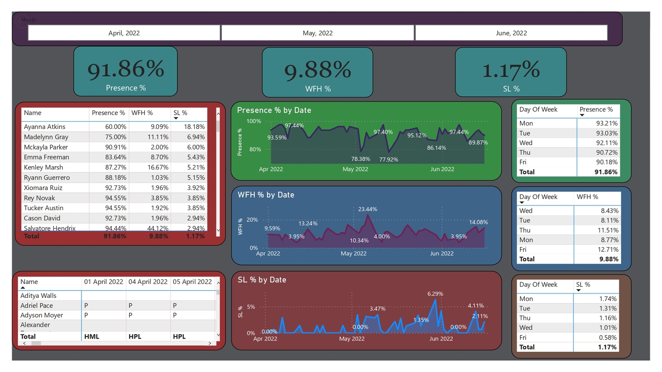
Analysis on Attendance Sheet
There are several steps of creation of Dashboard: 🔴 Problem Statement 🔵 Loading Data 🔵 Data Cleaning in Power BI 🔵 Data Visualization or Creating Dashboard
Atliq Hardware is a company that supplies computer hardware and peripherals to many of its clients. They have a head office in Delhi and this company has branches in other parts of India as well.
HR of Atliq Technologies have an attendance sheet and from the attendance sheet, she wants to know the working preference of people like:-
who is working from home, who are working from home, who’s on sick leave, who’s on paid leave, who is working half day from home and half day from the office.
So, the frustrated sales HR approaches a data analytics team and asks them to create a dashboard that would help him provide insights on presence percentage.
Importing attendance sheet in power bi, and combining excel data together in a proper format
Loaded all the data files in Power BI and transformed the data. Removed unwanted rows, Columns headers were named correctly and we have each and every date in a different column so instant of having each column, I’ll have one column which is going to contain all the dates.
Data Visualization in Power BI Now comes the interesting part i.e. creating visualizations. I have created a report where we can see the work-from-home percentage sick leave percentage and presence percentage. Measures were created using the DAX and appropriate charts were created to show the trends and patterns finally the insights were generated.
Project information
- Category Dashboard
- Project date 15th Oct 2022
- Dashboard URL hranalysis.pbix